Issues around indicators
| Attachment | Размер |
|---|---|
| ict-indicators.pdf | 6.03 MB |
5. Issues around indicators
Indicators are not value free, but because they are expressed in numbers, they appear to be objective answers to what may be straightforward questions, such as, how many people have access to a telephone? The Partnership on Measuring ICT has made significant strides in some of the definitional problematics, for example, in arriving at common definitions for terms such asaccessand methodologies for indicator collection. However, increasingly ICT indicators (or indices) attempt to demonstrate more complex questions, such as a nation’s e-readiness or the link between ICT and growth. This section seeks to identify ways in which indicators can be misused or misinterpreted.
5.1 Harmonising definitions and indicators
How many people have access to a telephone? There are now different ways to connect to telecom networks and there are different kinds of ICT services and applications to allow people to communicate with others. Accordingly, there has been a shift from a focus on universal service – signalling aspirations for a fixed line to every home to provide affordable basic telephone service – to universal access – recognising the possibility of providing reasonably affordable access to communication services across communities by different access channels. Universal access terminology recognises that having access to a telephone does not necessarily imply ownership of either a fixed telephone or a mobile handset. However, beyond ownership there are the further categories of subscriber, user or percentage of the population within range of a signal. The definition for user varies widely from someone who has used a telephone sometime during the last year, in the last three months, in the last month, a certain number of times per given timeframe, etc. It is easy to see how usersandsubscribersmight be inadvertently used interchangeably, thus creating inaccurate perceptions. In the same vein, the percentage of the population (or number of inhabitants) with access to a signal does not actually tell us how many are able to avail themselves of productive use of the signal.
If we consider the community access points identified in the country case studies in this report, we find that there are telecentres, kiosks, public internet access points, community technology centres, public service stations, coin-operated public phones, etc. It is difficult to compare these across countries, not because they have different names, but because the different names refer to different entities. Some are stand-alone public telephones, others are telephone resell points (and just these two examples have very different business models and service implications); others provide internet services, which may include voice over internet protocol (VoIP) telephony, others may be service centres which provide support services in addition to technology access, and so forth.
Harmonisation of terminology and methods for assessing and assigning values also needs to occur at other levels, such as tariffs (per-minute, per-second or per-pulse charges or flat rates); affordability, which involves regional differences; accessibility, in terms of distance; broadband services, for which there is some dispute between 3G and WiMax offerings; and so forth. In order to illustrate the importance of such precision around terminology, consider that lack of precision can result in claims that an operator has fulfilled universal access requirements by installing a single payphone in a village in a context in which providing universal access fulfils licence conditions for exclusivity of service provision.
5.2 Indicators from supply and demand perspectives
Not surprisingly, there will often be a divergence between what operators want to demonstrate (supply of services) and advocacy needs that are made evident based on how ICTs and their applications and services are used and made available across different socioeconomic sectors of society. Clearly, supply- and demand-side concerns are two sides of the same coin.
Supply-side indicators depict the ICT terrain from the service providers’ perspective: how much of the terrain is serviced by a signal, how many fixed lines are available, how big the market is (for different kinds of services), the conditions of offer (pricing). This kind of data is captured in information that is required for reporting to regulators and government authorities (such as for taxation and business practices). In addition to the picture of the market that this information presents, a key question is: Who has access to this information? In many cases, operators retain such information for solely internal use; and in some cases, regulators obtain operators’ indicators but do not make them further available.
Demand-side indicators look to evidence about how services are consumed: by whom (e.g. which members of the family), where services are accessed, whether users would like to use services more than they do – and why they can’t do this (because the call centre is only open when they are at work, because it costs too much, because they do not know how to use particular service components, and so forth).
5.3 Qualitative vs. quantitative assessments
There are different ways of collecting and presenting information about the ICT sector, as illustrated in the previous section. With a view to international comparability and documenting progress by periodic sampling, there is a logic to using numbers. Aquantitativesurvey or assessment counts things: how many phone lines exist, how many homes and schools have computers, etc. However, as shown in terms of different examples of indicator criteria (Boxes 1 and 2), measuring the “digital divide” is complicated byqualitativefactors: aspects that are not easily counted, but which have a bearing on how effectively ICTs are deployed.
An over-reliance on quantitative analysis will fail to capture the quality of experience. For example, the introduction of computers into schools may produce impressive statistics, but a qualitative analysis will identify how well they are being used and what direction skill-development initiatives should take. Interviews and case studies can be used to collect this kind of qualitative information. The statistical presence of ICT infrastructure does not guarantee access to the full range of potential users. By way of another example, a teledensity indicator does not show how telephones are used. The typically low teledensity rates for developing countries must be understood in terms of the practice of shared use of such technologies – which is very much less the case for developed economies, and not made explicit in the simple indicator.
| Box 1. BRIDGES’ REAL ACCESS/REAL IMPACT CRITERIA |
(1) Physical access to technology
|
| Source:bridges.org (< www.bridges.org>) |
| Box 2. ORBICOM'S ASSESMENT INDICATORS |
| Infodensity |
| Networks |
|
| Skills |
|
| Infouse |
| Uptake |
|
| Intensity |
|
| Source:Orbicom < www.orbicom.ca> |
5.4 One dollar a day and $100 laptops
By definition, indicators convey complex information in a more concise format. Although more useful in some senses, reductive presentation of complex realities may provide an image that rather than illuminating a situation actually conceals it. By way of example, for those working in the area of telecommunication, teledensity (the number of telephones per 100 people) has historically been a standard measure identifying a given level of telecom infrastructure development. It is acknowledged that a country's teledensity denotes an average across rural and urban areas, and that there may also be socioeconomic constraints on use or roll-out of infrastructure in certain areas.
However, ICT indicators are becoming popularised and increasingly used by a wider set of actors from different backgrounds. Additionally, as ICTs have occupied an increasingly important space in society and the economy, they are much more reported in the popular media, which further simplifies presentation of indicators. An example of this is the almost sloganistic reporting that there are more phones in Manhattan than all of Africa. While this has limited use as an indicator beyond a very basic level of consciousness raising, it nonetheless paints an evocative picture that people can use to grasp the enormity of the “digital divide”. [11]That this quasi indicator has not been true for a long time is pretty much irrelevant to its continued use. [12]In the same vein, in the early 1990s, the number of times an encyclopaedia could circle the earth in a minute provided a visual image of the speed of computers that people who were not familiar with computers could relate to. Thus, ICT researchers, regulators and telecom service providers are clear on how teledensity is used. But new users of the terminology and indicator may not know to connect the indicator with its underlying nuances and components – opening the door to misinterpretation, misleading uses or fundamental misconceptions.
Another example of this is the international poverty indicator to identify the number of people in the world living in extreme poverty. This is the one dollar a day poverty line. Target 1 of the MDGs is to “Reduce by half the proportion of people living on less than a dollar a day.” This is a very strong and evocative image. Few people reading this publication could subsist on one dollar per day.
But what does it mean to live on less than one dollar per day? In simply asking this question it quickly becomes apparent that the image is paramount but that the indicator has little to do with any kind of purchasing power for people subsisting at this level (and perhaps even little to do with an accurate assessment of real extreme poverty levels). There are many different ways of measuring poverty and creating indicators to assess poverty and progress on its alleviation. Beyond a vague economic framing, the concept of one dollar per day provides very little actual information about the different conditions of poverty.
The$100 laptopis a similar catch-phrase phenomenon – positing an economic and technical solution for the inability to provide education to the world's poorest children. The terminology “digital divide” also posits a digitalsolution to divides that are entrenched in historical socioeconomic exclusion and inequalities. [13]Complex issues are framed only in economic and technical terminology. For ICT indicators, this issue also arises with the use of concepts such ase-readinessandaccessto embody a range of meanings across technical infrastructure, social factors such as language and content, and personal training and capacity attributes.
5.5 Different priorities, influences and results
Over the past decade and a half, there has been an increasing proliferation of studies documenting the fact that ICTs are fundamental to our economies and societies. And there has also been a growth in indicator indices to assess and encapsulate different aspects of sector growth, ICT diffusion, links between ICTs and productivity, the economy, educational attainment, and so forth. In short, there are a range of different reasons for wanting to measure ICT. The Sibis report (Technopolis, 2003) discusses the traditional approach of ICT measurement across three fundamental views of access,useandimpact, with access being the easiest area to objectively document and historically the predominant focus of ICT indicators.
Table 2 lists ICT indicators indices, which assess and rank countries on various aspects of ICT diffusion and absorption. While at a glance they all appear to be concerned with a similar and common outlook on a similar area of inquiry, they actually have a range of different foci based on which element of access, use or impact is most strongly stressed. These are generally the overarching categories for assessment, although each major ICT indicator index uses varying terminology indicating the particular spin on their signature ICT indicator index. For example:
- Digital Opportunity Index:opportunity,infrastructure, andutilization.
- Orbicom Infostate Index:infodensity(the sum of all ICT stocks), andinfo-use(consumption flows of ICTs/period), withinfostatebeing the aggregation of infodensity and info-use.
- Economist Intelligence Unit E-Readiness Index: connectivity and infrastructure;business environment;consumer and business adoption;legal and policy environment;social and cultural environment; and supporting e-services.
- Network Readiness Index (World Economic Forum):environment,readiness, andusage.
- Index of ICT Diffusion (UNCTAD):connectivity, accessandpolicy.
A study on the gender “digital divide” in Francophone Africa,A Harsh Reality, asserts that components for a gender “digital divide” indicator should comprise: control,content relevance,capacitiesandconnectivity (Mottin-Sylla 2005, p. 34). A vantage point neglected in the design of most ICT indicator and statistical collections is on gender differences in terms of access, use and impact. Use and impact issues are often premised upon access indicators, and this is problematic. Countries demonstrating increased infrastructure access may be occluding who is allowed to use the technology at a community or household level. While a gender-sensitive ICT indicator will collect information on access, use and impact in a disaggregated gender format, the gender “digital divide” indicator devised for the Francophone Africa study is prescriptive, providing information with the intention of targeting women’s additional unequal conditions for correction. The Real Access/Real Impact criteria developed by Bridges [14]and Orbicom’s assessment categories (Boxes 1 and 2) further illustrate frameworks extending beyond access to infrastructure.
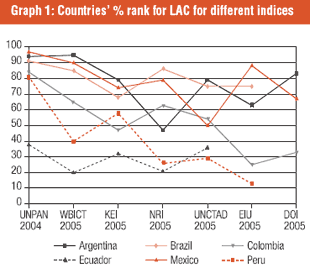
Graph 1 shows the lack of consistency across the different indices. The country results for different indices are shown here as a percentage of their ranking at the Latin American and Caribbean level. Thus, if the findings were similar across the indices, there would be incidence of parallel lines as there is for Argentina, Brazil and Colombia for the UNPAN, WBICT and KEI indices – as shown at the top left corner of the figure. This, however, is the only point of parallel findings – with widely divergent results. Kauffman and Kumar (2005) attribute this to the fact that there are three overarching perspectives for single item composite ICT indices, such as shown here. These are ICT readiness, ICT intensity, and indices attempting to measure impacts of ICTs. Minges’ (2005) work further illustrates the trade-offs or different strategies of assessments. This is shown particularly well by Table 1, a table he uses to depict the different choices for ICT infrastructure within indices.
| Number of indicators related to infrastructure | 3 | 6 | 10 | 8 | 2 | 3 | 4 | 12 | 4 | 6 | 5 | 11 |
| Number included in infrastructure category | 3 | 2 | 5 | 8 | 2 | 3 | 3 | 8 | 4 | 4 | 5 | 5 |
| Internet penetration | X | O | O | X | X | X | O | O | X | X | ||
| Mobile penetration | X | X | X | O | X | X | X | X | ||||
| Fixed penetration | X | X | X | X | X | X | X | |||||
| PCs per capita | X | X | O | X | X | X | ||||||
| Total telephone penetration | X | X | X | X | ||||||||
| Internet host penetration | X | X | X | X | ||||||||
| Internet affordability | O | O | X | O | ||||||||
| Secure internet servers | X | X | O | |||||||||
| International internet bandwidth per inhabitant | O | X | O | |||||||||
| Broadband penetration | O | O | X | O | ||||||||
| Electricity consumption | X | X | ||||||||||
| Proportion of households with fixed line | X | O | ||||||||||
| Proportion of households with a TV | O | X | ||||||||||
| Mobile tariffs | O | O | ||||||||||
| Proportion of households with internet | X | |||||||||||
| Mobile internet subscribers | X | |||||||||||
| Proportion of households with a PC | X | |||||||||||
| Waiting lines/main lines | X | |||||||||||
| Digital lines/mainlines | X | |||||||||||
| Cable TV penetration | X | |||||||||||
| Secure servers/internet hosts | X | |||||||||||
| Technology exports | X | |||||||||||
| TVs per capita | X | |||||||||||
| Hotspot (WiFi) penetration | X | |||||||||||
| Local call charge | O | |||||||||||
| Fixed tariffs | O | |||||||||||
| Mobile population coverage | O | |||||||||||
| Source: Minges (2005) | ||||||||||||
| Note: “X” means the indicator is found in an infrastructure category whereas “O” means that the indicator is included in the index but located in another category. |
Small differences in choices of indicators can result in dramatically different rankings across countries. One example highlighted is the different results achieved for two indexes measuring countries' technical capabilities. The UNDP's Technology Achievement Index (TAI) countedInternet hosts, whereas the Arhibugi and Coco (ArCo) assessment counted Internet users. Minges (2005, p. 22) comments: “Because a host can be located anywhere, it is not really a good measure of the intensity of internet usage in a country.” In the same vein, Goswami (2006) argues that the Networked Readiness Index (NRI) has too many components:
[S]tate of cluster development, number of utility patents, subsidies for R&D, administrative burden, efficiency of tax system, overall infrastructure quality, extent of staff training are factors common to a number of industries and have little connection with ICT environment, readiness or usage per se. However, they have the same weight as other more directly related ICT indicators.
Indicators should be explicit with regards to their respective methodologies. It is often the case that methodological statements remain unread; indeed, many users of indicators lack the necessary background in quantitative methods necessary to understand the complex statistics or do not have the time to consider the raw data. Nonetheless, complex calculations (by experts!) bundled into a single index number that is offered at face value is not best practice and does not leave open the opportunity for subsequent analysis and scrutiny. The security indicator example above illustrates how indicators can be used out of context to misrepresent a given situation. The same can be done simply by not clarifying the methodology behind the indicator. As shown in the examples around data collection, there are different ways for collected data to be biased or inaccurate. The same can also be true for how the data is subsequently treated to form the basis for an indicator.
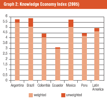
Transparency questions are not all pernicious. Some are simply questions of avoiding misinterpretation or imprecision because of lack of clarity around methods. Graph 2 provides an example of this. The Knowledge Economy Index offers the overall indicator in absolute terms or as adjusted for population. As can be seen in the figure, this results in a significant difference for Latin American economies with large populations such as Brazil and Mexico, where there are likely to be larger gaps between different socio-economic sectors and between rural and urban inhabitants.
5.6 Gender
Despite repeated calls for inclusion of gendered indicators and statistical information disaggregated by gender, there is still lack of progress in this regard. Huyeret al(2003) discuss a number of important points around why ICT indicators disaggregated by gender are so important. The first goes to the issue of women being instrumental in the poverty reduction targeted by the MDGs. Secondly, “ICTs are expected to play a catalytic role as well” (Huyer et al, 2003). With studies showing that for the financially constrained there is a generalised positive social impact of women’s access to ICT – particularly in terms of family health, but also in terms of employment – it is imperative first to mobilise advocacy around inclusion, and subsequently to monitor womens’ and girls’ participation in the information society. This is of course difficult to undertake if gender-disaggregated statistical information is not made more routinely available.
Although it is often pointed out that the “digital divide” is a manifestation of other already existing (and entrenched) divides, Huyeret al(2003, p. 145) provide evidence that the “relationship between the gender divide and the overall digital divide is very tenuous and does not support the argument that the two move in tandem.” Thus, work to reduce a “digital divide” will not necessarily extend benefits to women and girls – unless the programme is specifically targeted and implemented with the intention of addressing their particular needs within particular socioeconomic contexts.
Until 2003, the only sex-disaggregated ICT data collected by the ITU was the percentage of female employees in telecom administrations, and since 2003, it has added only two new sex-disaggregated indicators: female internet users as a percentage of total users, and female internet users as a percentage of females (Halfkin, 2006, pp. 52-53). Internet use indicators are important, but for developing country contexts, access to mobile telephony is also a very important indicator, as mobile telephony is rapidly becoming the predominant means for universal access. The Research ICT Africa household surveys [15]specifically addressed mobile access by women and men – one of the first large-scale ICT index studies to do so.
5.7 Summing up…
We rely on indicators to inform advocacy processes and to assess the progress of ICT in terms of contributing to social goals. Because of some of their inherent biases, strategic use of indicators means being cognisant of these biases, and further, explicit in our own proactive biases around inclusion and empowerment. This means that demand-side indicators are especially important to inform analysis across different social classes and marginalised sectors of the population. Qualitative approaches in particular can further inform quantitative assessments. Household surveys and affordability studies are examples of such contributions. The project to fill in the gaps of questions that are not asked, sectors of the population who are not surveyed, and correcting or adding to indicator methodologies, is not a project that should happen on the sidelines of mainstream indicator communities.
Further, it may be useful to focus more on demand-side information to better ascertain technological adoption and productive integration into different societal sectors.
[T]he shortening of technology product life cycles makes any tracking measurement problematic. The problem is compounded by the fact that user definitions and perceptions of technology vary across countries. Therefore, over the medium and long term, measuring experience, measuring consumers’ satisfaction levels, insulates indicators from changing technology and its varying nomenclature (Technopolis, 2003, p. 15).
Because of the multiple paths to connectivity that now exist, with new paths emerging, what will be most important to document is the quality of access and subsequent impact on quality of life and creation and opening up of opportunities, necessitating a more qualitative approach to devising indicators and more nuanced understanding of impacts.